As a follow-on from my recent post on responsive web design (RWD), I thought it might be useful to take a look at another one of the challenges arising from the new generation of computing devices, and at one particular solution we’ve arrived at for our own projects.
The challenge of hi-DPI
Hi-DPI is a generic term used to describe the increased-resolution displays featured in many modern mobile devices and a in small number of very recent computers. Some manufacturers have there own terms for such screens: most prominently Apple Inc. use the trademarked name Retina to describe their own hi-DPI displays.
The term hi-DPI is a contraction of ‘high dots per inch’ and refers to the density of pixels found in a one inch line on the given display. To be considered ‘hi’, the display would typically have a density greater than 160dpi – often much greater.
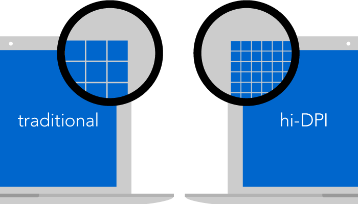
The popularity of these displays presents a significant challenge to web designers as, ever since the web first gained support for images, we’ve optimised all of our graphics down to the standard resolution for traditional desktop PCs – a lowly 72dpi. Meaning that, although they look ok on old-school displays, these graphics look pretty nasty when viewed on modern devices.
Why should I care?
At Iriss, we’re of the belief that the products we build should represent the best possible quality that we’re capable of producing. While it might be tempting to put off catering for hi-DPI displays until they’ve become the norm rather than the exception, we prefer to ensure that our sites have the highest possible quality of fit and finish for all our users. We also believe that clearer text and graphics aid usability, and further, that catering for hi-DPI displays now is the most future-friendly approach (after all, the number of these displays in circulation is only going in one direction, and it isn’t down).
Designing for hi-DPI
There are many different kinds of graphics on the web (photographs, background images, user-interface elements like buttons and icons, etc), and many different formats that these can be rendered in. Addressing the issues and possible solutions around every one of these is well beyond the scope of this article, so today we’re going to look at just one type of graphic that features in nearly every modern web site, and at one particular solution we’ve arrived at that provides pin-sharp images irrespective of resolution.
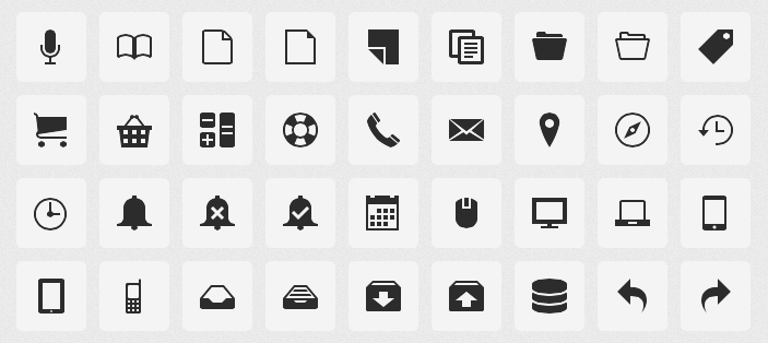
Icons
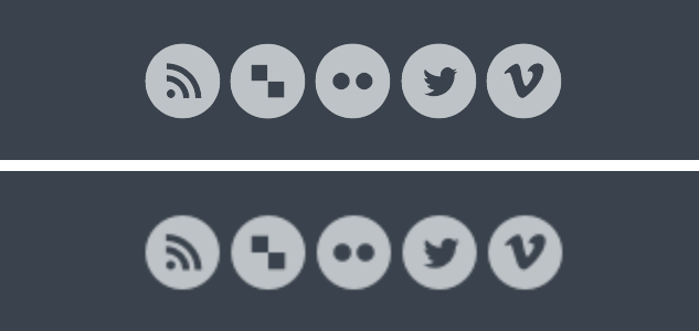
Most modern websites utilise icons for a number of purposes, most commonly to help aid at-a-glance identification of buttons and interface elements. When redesigning the Iriss website in early 2011 we made the decision to use icons to represent, amongst other things, the RSS and social media links in the footer area of the website. Initially, these were realised as traditional images, and coded into the page using text links in the HTML, with CSS trickery seeing those links replaced in visual browsers with our carefully wrought graphics.
However, June 2010 had seen the release by Apple of the iPhone 4 – the first device with a Retina display. Testing the new Iriss site on the iPhone 4 was a sobering experience. The graphics, and the icons in particular, didn’t respond at all well to being displayed at such revealing resolutions. There had to be a better way…
Raster vs vector
Computer graphics essentially come in two flavours – rasters (sometimes referred to as bitmaps) and vectors.
Raster images are dot matrix structures that are mapped out in a pixel-by-pixel rectangular grid. They have a fixed resolution, and can’t be enlarged beyond that without a serious drop in perceived quality (that “enlarge and enhance” stuff only works in the movies). On the web, raster images are usually found in jpeg, gif or png formats.
Vectors on the other hand are stored as mathematical expressions, and are drawn geometrically every time they are rendered. For this reason, vector images are said to be ‘resolution independent’ – since they are drawn anew each time, they can be set to any size at all without loss of quality. The primary vector format for the web is SVG (Scalable Vector Graphics).

So SVGs are the perfect solution, right?
Sadly not. Although they’ve been around since the end of the last century, uptake of the SVG format has been slow. Support remains patchy at best, with Internet Explorer versions 8 and under, and older versions of Google’s Android operating system, having no support for SVG whatsoever.
Ah, ok, so that rules out vectors then…
That’s what we thought too. Until, one day while marvelling how crisp text looked on a then newly-released Retina iPad, the penny finally dropped – fonts are vectors too! Typefaces are stored within font files as mathematical expressions, and are drawn at whatever size you need them, just like all other vector graphics. So why not turn our icons into a font?
Icon fonts
The CSS2 specification, published as long ago as 1998, includes something called @font-face. This (somewhat controversial) technology allows web pages to display their text content using a font which, rather than being installed on the user’s own machine as is the norm, instead lives on a web server. This means that we can safely design our own font, put it on our server, and tell the user’s browser to use that font to render certain text and symbols on our pages.
Better yet, browser support for @font-face is generally superb – it even works in Internet Explorer 6 (and nothing works in IE6!)
With our icons having been drawn in Adobe Illustrator (meaning the original source files were already vectors), all we had to do was package them up into the various web font formats that the different web browsers use for @font-face substitutions, then map the various icons to characters that our web site could reproduce. There are a bunch of tools available that will do this work for you, including:
- IcoMoon App (hint: this is our favourite)
- Fontello
- Inkscape (see this article for info on using Inkscape to make icon fonts)
A few minor changes to the HTML and CSS later, and we had our vector icons up and running beautifully on the IRISS website.
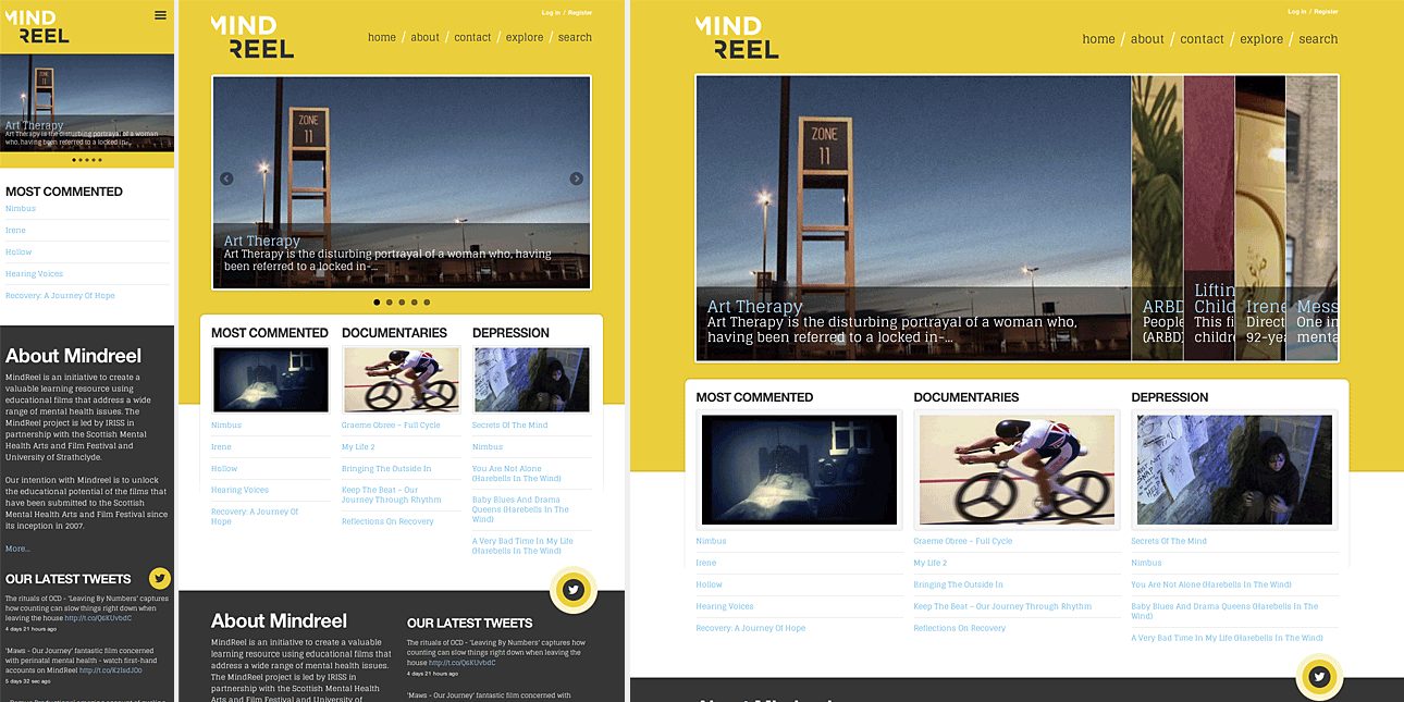
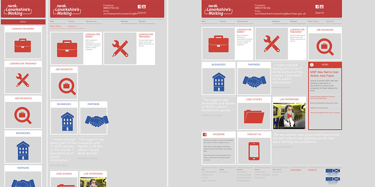
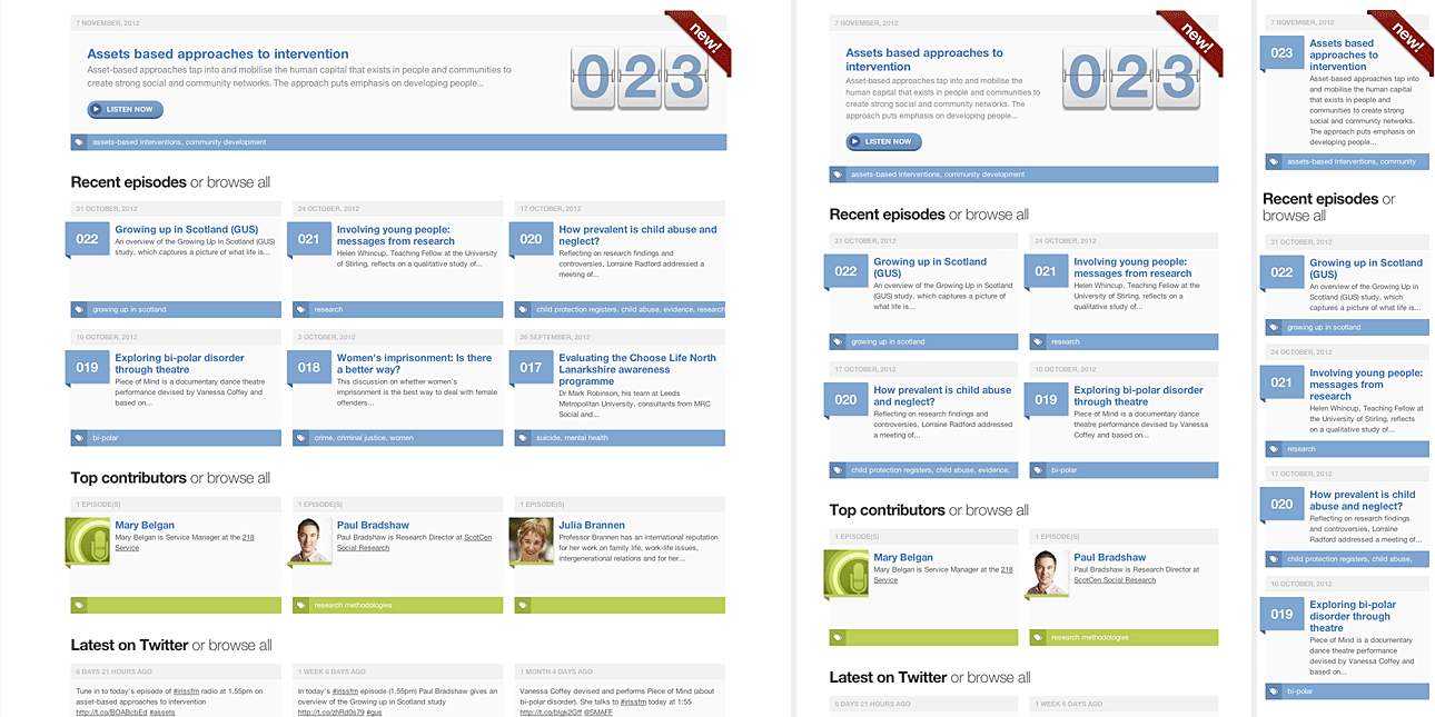
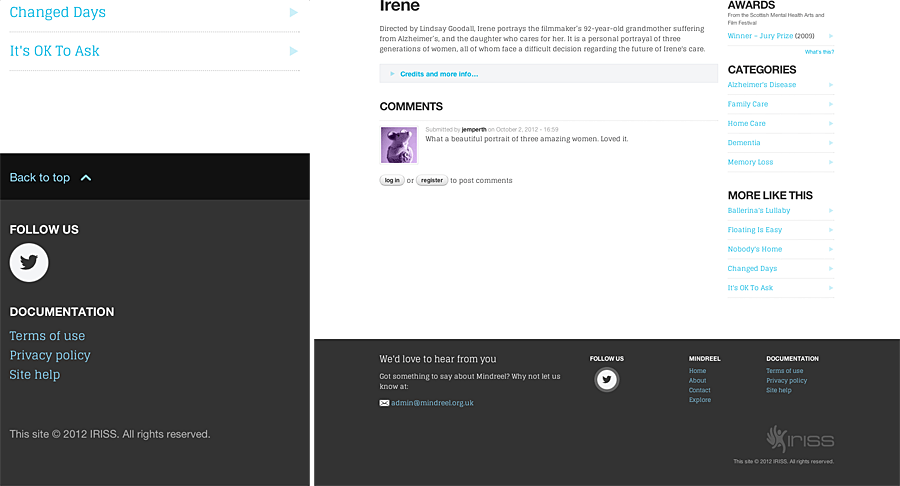
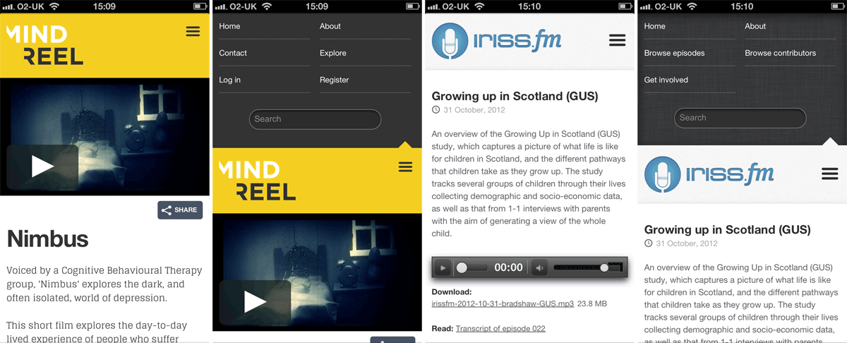
We’ve since used this method extensively while developing Iriss.fm and Mindreel, and retro-fitted it to another of our online resources.
Don’t like drawing? No problem
So, unsurprisingly, it turns out that we weren’t the first people to arrive at this solution. If you don’t want to draw your own icons, there are now plenty of ready-made icons fonts available to download and use. However, there are a few potential negatives to be aware of if going down that particular path: some of these cost money to use; most will include many more icons than you’ll ever truly need; many won’t feature all of the icons that you do actually want – and all those unused glyphs contribute to larger files for the user to download.
A better plan in that case would be to leverage either IcoMoon App or Fontello to pick and mix the icons you need from the different pre-made icon fonts they offer. You can then download these as a custom font containing only the icons you want and no more.
Conclusion
While no solution is ever entirely perfect, we’re really happy with the way our custom-designed icon fonts render across both traditional lo-DPI displays and the new hi-DPI equivalents. We’re still evolving how we work with these techniques, and have a few ideas that might further enhance our future projects.
Icon fonts: the pros
- Future-proof: provides infinitely scalable design elements
- Cross-browser compatible (they even play nice with legacy browsers)
- Small file-sizes against comparable raster-based solutions
Icon fonts: the cons
- Single-colour only
- Sub-pixel anti-aliasing can make them look blurry when rendered at small sizes on some low-resolution displays
- There’s a maintenance overhead: changing a single icon requires regenerating the whole font