This week has been an interesting experience (and a first!) for me.
We spent some time designing a title and brand for the project.
IRISS’ creative in residence, Andy, sketched up some initial titles. We voted on our favourite idea within the project team. Then Andy and Kate got to work on making the design come to life!
I made sure to keep a record of the magic!
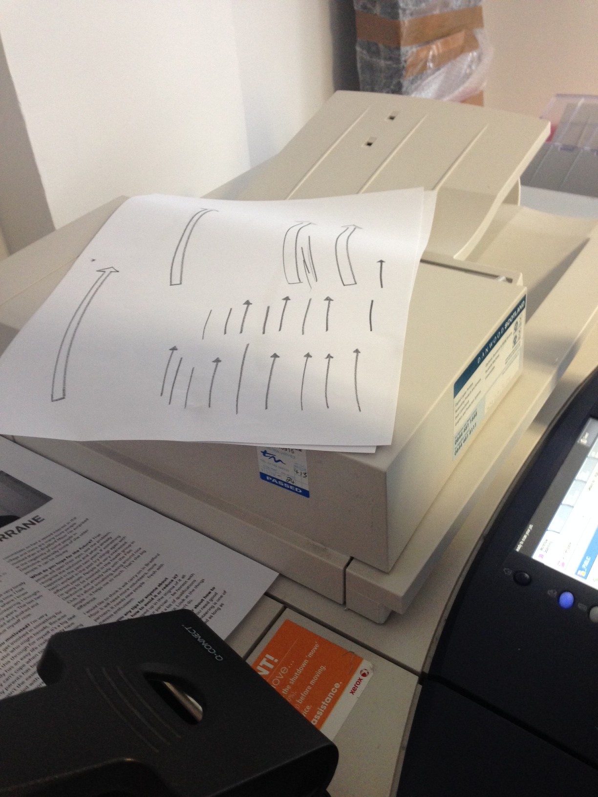
A big part of the work that Andy and Kate did was making sure the hand drawn images kept their authenticity, and Kate resisted the urge not to make them too neat and perfect. We wanted to keep it nice and energetic!
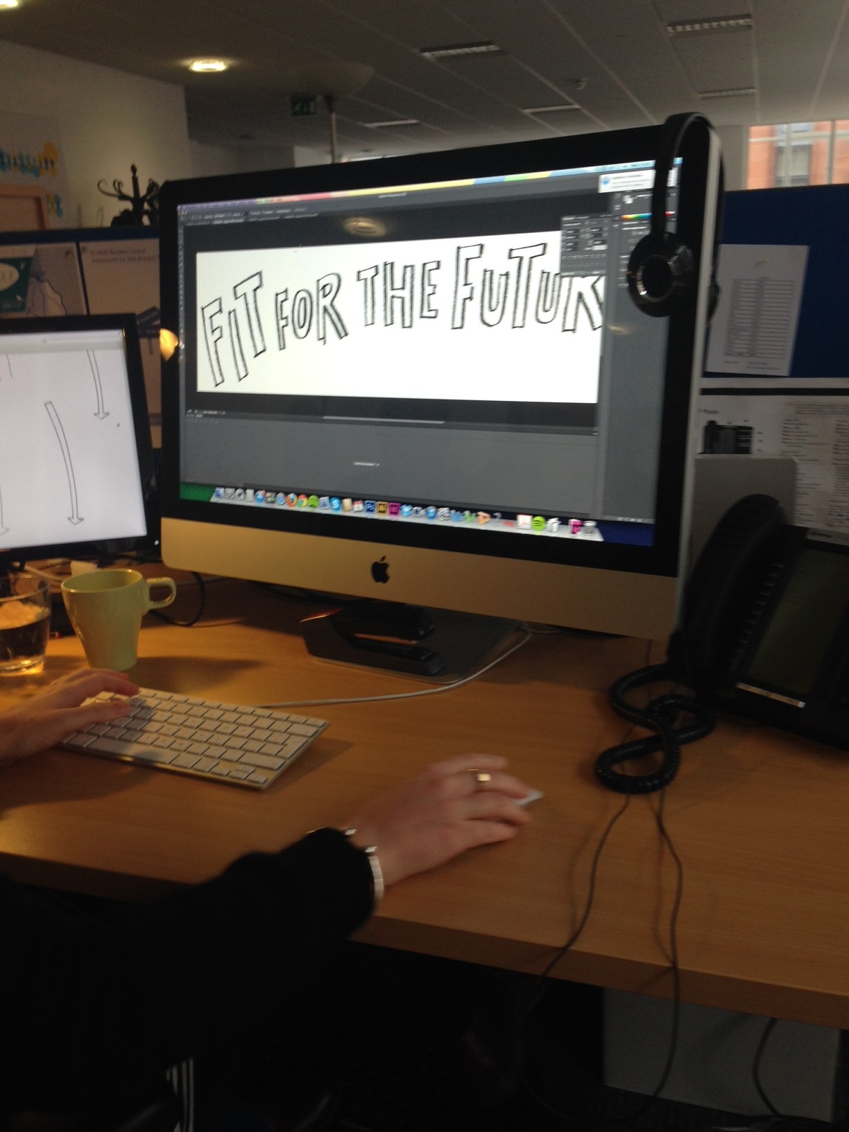
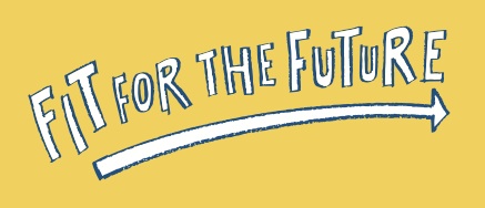
Kate then got to work adding colour to the sketches- using Scottish Care’s theme Reshaping Care logo colours and making it bright and bold!
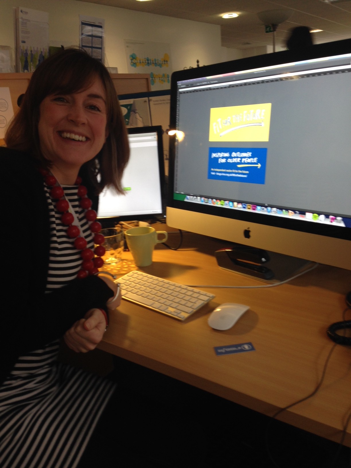
And the final result? A bright, recognizable and friendly logo!
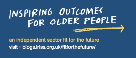
We chose ‘inspiring outcomes for older people’ because it got to the heart of what the project is really about – the lives of older people.
If you’re lucky enough to be attending Scottish Care’s Annual Care Homes Conference, Exhibition and Awards 2013 this Friday 15th November , you can get your hands on these little cards – and hear a little more about Fit for the Future.