After the spending the first week of the project in doing user research, gathering insights and collation of data we moved onto the second week when we started making sense of the data and seeing patterns. Some of the tools that we used are mentioned below..
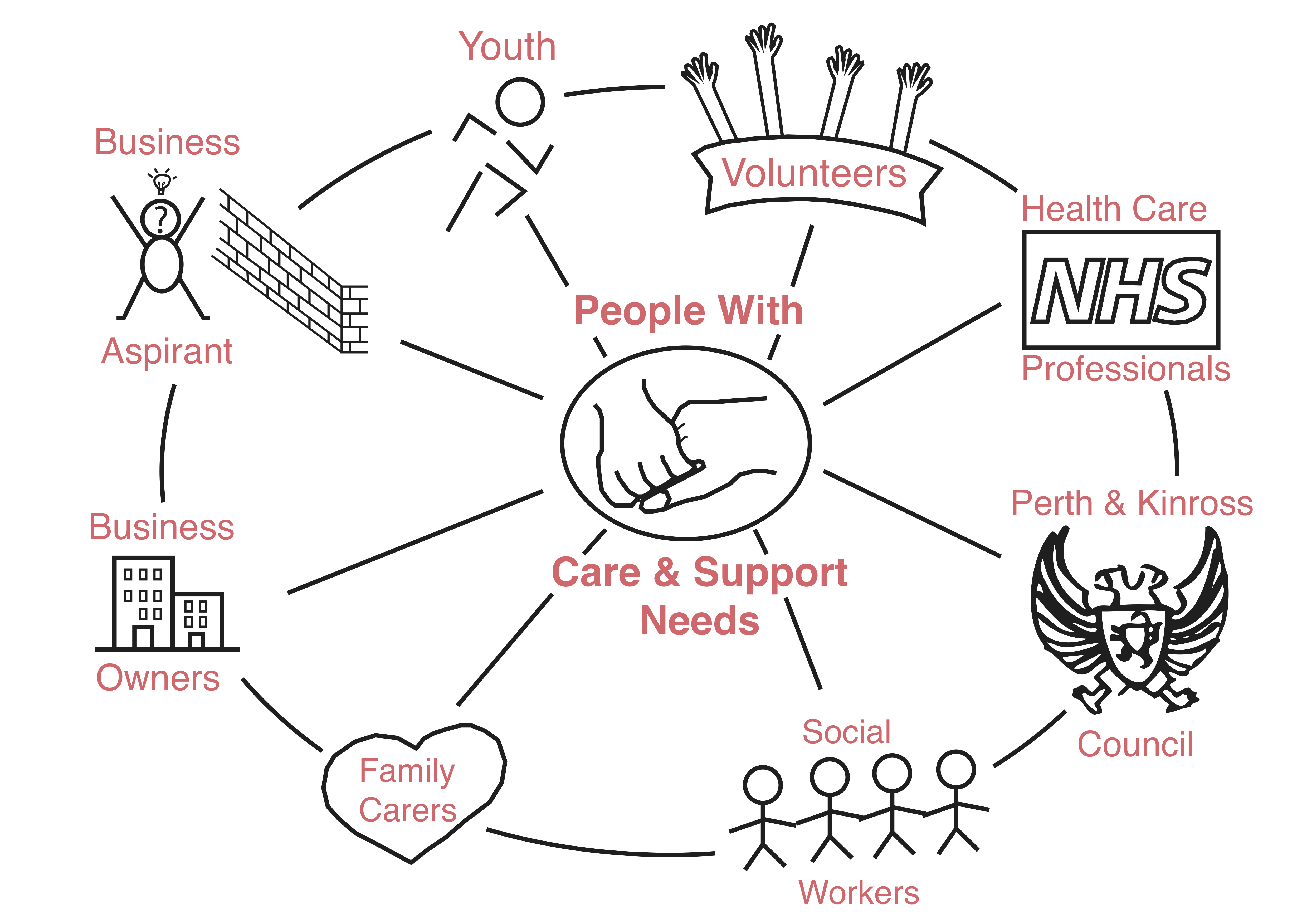
Stakeholder Maps: The map represents the different cross sections of people whom we spoke to and whom we believe can play a role in providing better care and support in Pitlochry.After coming up with the stakeholder map we moved on to mapping the Assets and Pain points in Pitlochry that we gathered from the field.
Some of the Assets of Pitlochry that we found out are:
- It has a rich scenic beauty and people generally feel very safe in Pitlochry
- It’s an active community with various activities for the older people
- There are 130 + voluntary organizations working there
- There are business owners willing to mentor aspirants wanting to start businesses
- Tourism is a very strong aspect and source of economy
- Famous for its Victorian Heritage whole area is rich in standing stones, stone circles and ancient sites
- There is a strong sense of community and the care options available is good
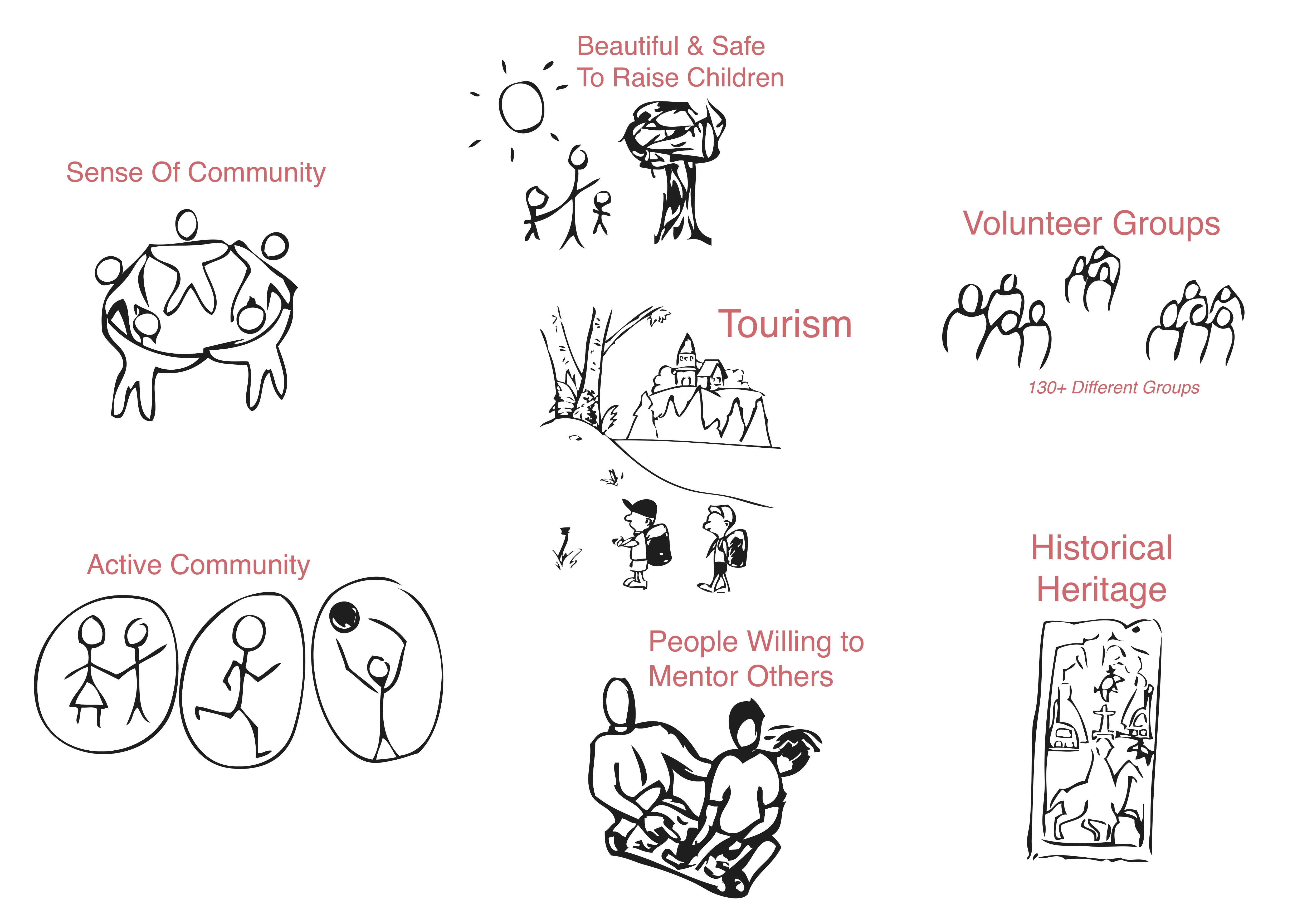
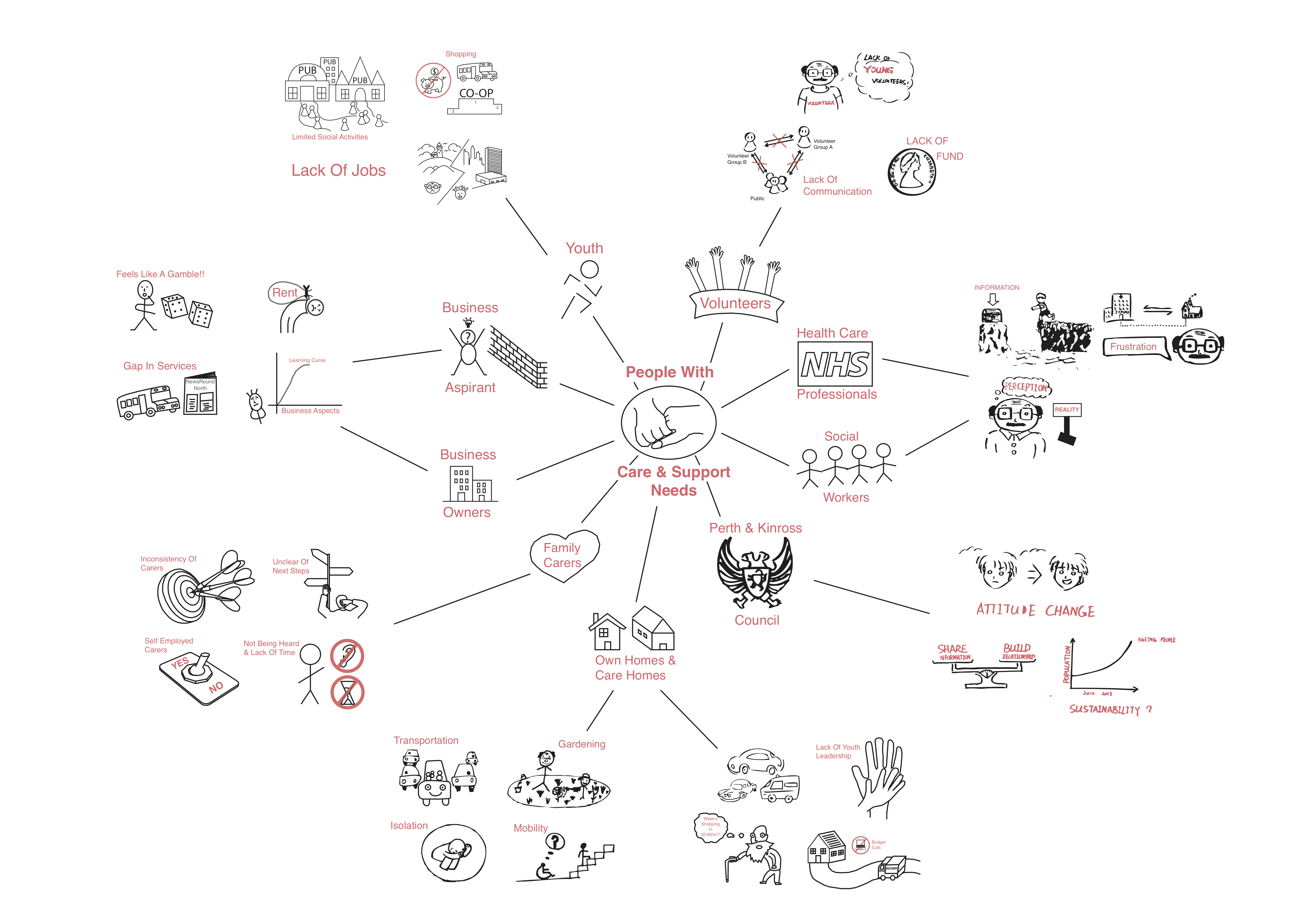
A pictorial representation of the assets is shown belowThe Pain Point Map given below served many purposes for us. It served as a single place of reference for all the challenges that the different people were facing. It enabled us to step back and take a systemic view during our ideation process. It showed to us that many of the problems were inter related and trying to solve one aspect would push the problem to a different point in the systemWith the all these different maps helping us make sense we felt more confident with our ideation process which we talk about in the next post.