how to export an animated SVG from a webpage to Adobe After Effects – Part 2

In part one of this article I outlined a method for exporting an animated SVG from a web-page it had a few problems in this final part I’ll detail how I solved those problems.

Who you gonna call


Realising that a better method would be to observe the SVG itself as it changed in the browser, the animation library uses requestAnimationFrame to achieve silky smooth results so a small native query selector in that function outputted to console seemed to work, although the results almost killed my machine. It was becoming clear that any desktop browser was going to struggle with this level of processing and that something else was required. Enter PhantomJS, a headless WebKit powered environment that’s been around for a few years, in their own words:

PhantomJS is a headless WebKit scriptable with a JavaScript API. It has fast and native support for various web standards: DOM handling, CSS selector, JSON, Canvas, and SVG.

Running the web page in this required creating a .js file with some instruction for PhantomJS:

var page = require('webpage').create();
page.open('https://dl.dropboxusercontent.com/u/93658891/rendersvg/index.html', function(status) {
page.onConsoleMessage = function(msg, lineNum, sourceId) {
console.log(msg);
phantom.exit();
};
});

then running PhantomJS from the command line:

phantomjs runme.js

This echoes the output of console.log into the terminal window which I then copy and paste, split as before, with a bit more work this could actually be outputting the SVG frames directly as the PhantomJS API has file system functions thereby removing the need for AWK.

Once again I ran through a bunch of frames and it seemed to be in order at least but this time I had several ranges of frames where nothing was animated, exporting on the requestAnimationFrame function had given me too many frames so I ran them through Gemini – which can find duplicate files, but the numbering was now all out of order so After Effects would fail when a frame was missing. No to worry as the latest versions of OSX have easy batch easy renaming built right into finder, so highlight all, set parameters hit go done – we were back to nice sequentially numbered (8,261 to be exact), non-duplicate SVG files. Only one problem After Effects does not support SVG import.

The best option was to convert to another vector format that AE will import as a range of animation stills. EPS whilst more widely supported lost the frame size information during conversion (each frame would be a different size so lining them up one after another would be impossible) so that was quickly ruled out. Conversion to Adobe Illustrator format was the best option.

Adobe Illustrator has a scripting API that is accessible through a number of languages and this seemed like the obvious place to start. There’s several examples that ship with Illustrator and many examples on-line after a bit of hunting I also noticed that Illustrator also has actions like Adobe Photoshop, this allows to record a series of steps from within Illustrator which can then be replayed on single of multiple files. A short action with a save as Adobe Illustrator & Close file command and I was good to go. The initial test of this technique caused Illustrator to run out of memory at some point around the 4000 file mark, this happened several other times so I just restarted the process by moving the processed frames out of the source folder – in all it probably took about 5 hours.

The frames were imported into AE in seconds which allows me much greater creative possibilities with access to high quality scalability, proper alpha channel, better re-timing controls.

Harder Better Faster Stronger

As you will no doubt have noticed there’s several places where this technique could be improved to increase speed, reduced number of steps and be more automated and not rely on expensive proprietary software.

My list of things to look into:

  • Other animation Libraries
  • More in depth investigation of how each works
  • Automated optimisation of the SVG before animation
  • Prevent unnecessary duplication of frames during export
  • PhantomJS to export the frames directly to the filesystem
  • Investigate to EPS conversion to retain frame size as EPS is more widely supported
  • Conversion to AI via other automated methods – Adobe Scripting, Inkscape console

I may revisit the idea to improve the work-flow, if anyone has thoughts or improvements please share. I’d love to hear your ideas.

how to export an animated SVG from a webpage to Adobe After Effects – Part 1

Why?

Animating SVG in a web browser with code (usually javascript or CSS) can be done very quickly. There is a wealth of code that involve little more than linking the script & specifying a couple of variables, so experimentation is quick & easy.

https://dl.dropboxusercontent.com/u/93658891/rendersvg/index.html

Video saved the SVG

This first export was just to see if the animation would fit with the rest of the video and was achieved by fullscreening the browser window (Google Chrome) with little else running in the background, then QuickTime Player was used to capture a video of the animation.  Next I imported the footage into Adobe Premiere, selected a suitable track from the Free Music Archive, mixed it together and as a proof of concept it worked as expected.

Enter the devtools

The library I’m using to do the animated is vivus.js. A little digging into the  source revealed a function for including older version of Internet Explorer which forces the refresh of the SVG on each frame.  Idea! Now if only I could log each of those frames. A short console.log() in the right place and I appeared to be getting the correct information out.

Screenshot 2015-02-02 14.50.48

A quick copy and paste from the console to a text file, save as SVG and I appeared to be getting what I expected.

Screenshot 2015-02-02 14.52.58

Next step was getting all the frames out of browser, copy and paste was working ok if a little slow, the resultant text file was about 450MB.  To extract each SVG/Frame I used the UNIX tool AWK.  AWK is a powerful text processing tool that can spit a text file into multiples based on a set of rules, the following snippet splits each line that starts with <svg into a new file adding a name & incremental number (padded up to 6 zeroes so the frames can be sorted)

awk '/&lt;svg/{x=sprintf("F%06d",++i) ".svg";}{print &gt; x }' input.txt

tip: optimise your SVG and try to make it a single line – it’ll make it easier for automated processing.

Now I had a folder of 12,000 or so SVG’s.  A small sampling of these revealed a lot of duplicate or wrong frames – I then discovered that the IE method I’d hooked into was not giving me what I’d expected.  Back to the drawing board


In the next part I’ll discuss what my solution was and suggestions for improvements on that.

A Drupal recipe for Twitter Cards

We recently launched Creative Quarter. Looking to increase sharing on Twitter & Facebook we decided to add Twitter Card & Facebook open graph support. These allow a site owner to define what is presented in a preview on each of these networks.

a twitter card preview

Creative Quarter is built with Drupal 7 which along with it’s eco-system of modules & support is very good so it was just a case of picking a few good modules and setting them up, which was a few hours work.

Resolution-independent icons with custom icon fonts

As a follow-on from my recent post on responsive web design (RWD), I thought it might be useful to take a look at another one of the challenges arising from the new generation of computing devices, and at one particular solution we’ve arrived at for our own projects.

The challenge of hi-DPI

Hi-DPI is a generic term used to describe the increased-resolution displays featured in many modern mobile devices and a in small number of very recent computers. Some manufacturers have there own terms for such screens: most prominently Apple Inc. use the trademarked name Retina to describe their own hi-DPI displays.
The term hi-DPI is a contraction of ‘high dots per inch’ and refers to the density of pixels found in a one inch line on the given display. To be considered ‘hi’, the display would typically have a density greater than 160dpi – often much greater.
Traditional vs hi-DPI displays
The popularity of these displays presents a significant challenge to web designers as, ever since the web first gained support for images, we’ve optimised all of our graphics down to the standard resolution for traditional desktop PCs – a lowly 72dpi. Meaning that, although they look ok on old-school displays, these graphics look pretty nasty when viewed on modern devices.

Why should I care?

At Iriss, we’re of the belief that the products we build should represent the best possible quality that we’re capable of producing. While it might be tempting to put off catering for hi-DPI displays until they’ve become the norm rather than the exception, we prefer to ensure that our sites have the highest possible quality of fit and finish for all our users. We also believe that clearer text and graphics aid usability, and further, that catering for hi-DPI displays now is the most future-friendly approach (after all, the number of these displays in circulation is only going in one direction, and it isn’t down).

Designing for hi-DPI

There are many different kinds of graphics on the web (photographs, background images, user-interface elements like buttons and icons, etc), and many different formats that these can be rendered in. Addressing the issues and possible solutions around every one of these is well beyond the scope of this article, so today we’re going to look at just one type of graphic that features in nearly every modern web site, and at one particular solution we’ve arrived at that provides pin-sharp images irrespective of resolution.

multiple example icons
IcoMoon icons by Keyamoon

Icons

Most modern websites utilise icons for a number of purposes, most commonly to help aid at-a-glance identification of buttons and interface elements. When redesigning the Iriss website in early 2011 we made the decision to use icons to represent, amongst other things, the RSS and social media links in the footer area of the website. Initially, these were realised as traditional images, and coded into the page using text links in the HTML, with CSS trickery seeing those links replaced in visual browsers with our carefully wrought graphics.

However, June 2010 had seen the release by Apple of the iPhone 4 – the first device with a Retina display. Testing the new Iriss site on the iPhone 4 was a sobering experience. The graphics, and the icons in particular, didn’t respond at all well to being displayed at such revealing resolutions. There had to be a better way


Raster vs vector

Computer graphics essentially come in two flavours – rasters (sometimes referred to as bitmaps) and vectors.

Raster images are dot matrix structures that are mapped out in a pixel-by-pixel rectangular grid. They have a fixed resolution, and can’t be enlarged beyond that without a serious drop in perceived quality (that “enlarge and enhance” stuff only works in the movies). On the web, raster images are usually found in jpeg, gif or png formats.

Vectors on the other hand are stored as mathematical expressions, and are drawn geometrically every time they are rendered. For this reason, vector images are said to be ‘resolution independent’ – since they are drawn anew each time, they can be set to any size at all without loss of quality. The primary vector format for the web is SVG (Scalable Vector Graphics).

Twitter icon zoomed
Raster (left) and vector versions of the same icon at 10x zoom

So SVGs are the perfect solution, right?

Sadly not. Although they’ve been around since the end of the last century, uptake of the SVG format has been slow. Support remains patchy at best, with Internet Explorer versions 8 and under, and older versions of Google’s Android operating system, having no support for SVG whatsoever.

Ah, ok, so that rules out vectors then


That’s what we thought too. Until, one day while marvelling how crisp text looked on a then newly-released Retina iPad, the penny finally dropped – fonts are vectors too! Typefaces are stored within font files as mathematical expressions, and are drawn at whatever size you need them, just like all other vector graphics. So why not turn our icons into a font?

Icon fonts

The CSS2 specification, published as long ago as 1998, includes something called @font-face. This (somewhat controversial) technology allows web pages to display their text content using a font which, rather than being installed on the user’s own machine as is the norm, instead lives on a web server. This means that we can safely design our own font, put it on our server, and tell the user’s browser to use that font to render certain text and symbols on our pages.

Better yet, browser support for @font-face is generally superb – it even works in Internet Explorer 6 (and nothing works in IE6!)

With our icons having been drawn in Adobe Illustrator (meaning the original source files were already vectors), all we had to do was package them up into the various web font formats that the different web browsers use for @font-face substitutions, then map the various icons to characters that our web site could reproduce. There are a bunch of tools available that will do this work for you, including:

A few minor changes to the HTML and CSS later, and we had our vector icons up and running beautifully on the IRISS website.

Social icons full at normal size on Retina iPad
Icons viewed at normal size on Retina iPad – icon font at top, graphic version at bottom

We’ve since used this method extensively while developing Iriss.fm and Mindreel, and retro-fitted it to another of our online resources.

Typical Mindreel page with icons highlighted in red

Don’t like drawing? No problem

So, unsurprisingly, it turns out that we weren’t the first people to arrive at this solution. If you don’t want to draw your own icons, there are now plenty of ready-made icons fonts available to download and use. However, there are a few potential negatives to be aware of if going down that particular path: some of these cost money to use; most will include many more icons than you’ll ever truly need; many won’t feature all of the icons that you do actually want – and all those unused glyphs contribute to larger files for the user to download.

A better plan in that case would be to leverage either IcoMoon App or Fontello to pick and mix the icons you need from the different pre-made icon fonts they offer. You can then download these as a custom font containing only the icons you want and no more.

Conclusion

While no solution is ever entirely perfect, we’re really happy with the way our custom-designed icon fonts render across both traditional lo-DPI displays and the new hi-DPI equivalents. We’re still evolving how we work with these techniques, and have a few ideas that might further enhance our future projects.

Icon fonts: the pros

  • Future-proof: provides infinitely scalable design elements
  • Cross-browser compatible (they even play nice with legacy browsers)
  • Small file-sizes against comparable raster-based solutions

Icon fonts: the cons

  • Single-colour only
  • Sub-pixel anti-aliasing can make them look blurry when rendered at small sizes on some low-resolution displays
  • There’s a maintenance overhead: changing a single icon requires regenerating the whole font

The Twitter learning curve

We had our first IRISS Asks session on Twitter on Friday November 9th. IRISS Asks is where we ‘ask’ a social services/social care related question on Twitter in order to generate a discussion around the topic (hashtag: #irissasks). Generally it went well, but it kicked off an interesting internal discussion about the gradient of Twitter’s learning curve for new users.

It’s well known that Twitter can be a confusing place for the uninitiated, as this spoof Jack Nicholson account nicely demonstrates (reads from bottom up):

Fake Jack Nicholson on Twtter
The very fake @JNicholsonReal's first day on Twitter

Although Twitter has an extensive Help Center, with a range of thorough guides, the sheer amount of information on there can itself be off-putting. Ideally, it’d be great if Twitter could rethink its onboarding of new users and do a better job of educating them about things like hashtags and replies at the point they first sign on.

Oh, and if you’ve ever been caught out by Twitter’s @reply system then don’t worry, you’re in good company. It seems Twitter’s latest addition to its board of directors Peter Chernin (the man who killed oversaw MySpace for News Corp.) accidentally formatted the tweet announcing his appointment as a reply to Twitter’s own official profile, meaning that only those of his followers who also happen to follow the official Twitter account would get to see the announcement:

@twitter I’ve been a long-time user of twitter for news and information. Happy to be joining board of this very exciting company.

Designing for the post-PC age

Hi, I’m Ian and I’m an Interactive Designer here at Iriss. Today I’m going to take a look at Responsive Web Design (RWD), and how we’ve implemented it in a couple of recent IRISS projects.

Background

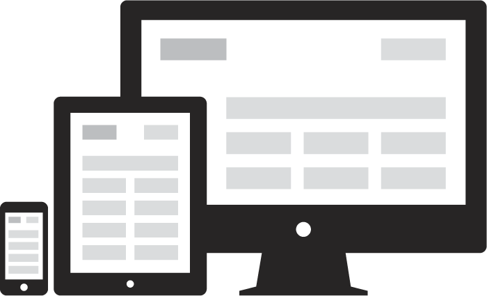
The last few years have seen a fundamental shift in the way people access and use the web. In 2012 the Internet is no longer limited to your computer screen. It’s just as likely that you’re reading this article on your phone, your tablet, your laptop/netbook/ultrabook (and if you’re reading this a few years down the line, I can only imagine what you’re reading it on!) As a web designer, this new multi-platform, post-PC world presents some interesting challenges.

As a community, web designers are well-practised in the art of self-deception. For years we’ve pretended that we knew, or at least had a rough idea of, the dimensions of the screen that the people who use the things we build will view them on. We embraced something called the 960 grid in the belief that a one-size-fits-all system would streamline our design process while providing a layout that would work for (nearly) all of our end users. We fooled ourselves into believing that something we couldn’t possibly know (the size of our end users’ screens) could be standardised as something we did know. In short, and to channel Donald Rumsfeld for a moment, we had chosen to treat a known-unknown as if it where a known-known. With the rise of the mobile web, however, we’ve been forced into recognising the unsustainability of that delusion: the simple truth is that we have no way of knowing the size, ratio and resolution of the screens on which our designs will ultimately appear. The solution
?

Responsive web design across devices

Responsive Web Design (RWD)

RWD can most simply be defined as a method that allows web pages to respond to fit their environment. So when you visit a responsive web page, its design should take our multi-platform world into account, and morph to ideally match the size and shape of the screen you’re viewing it on.

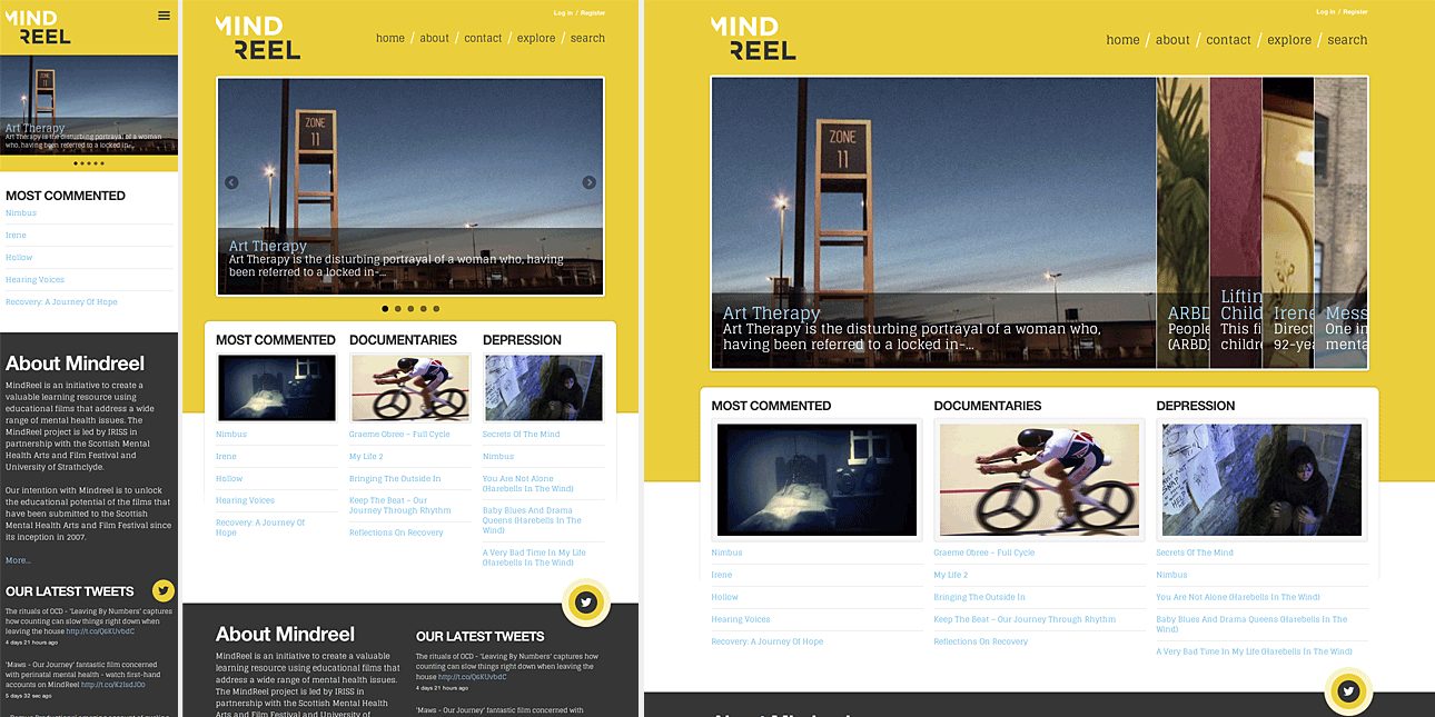
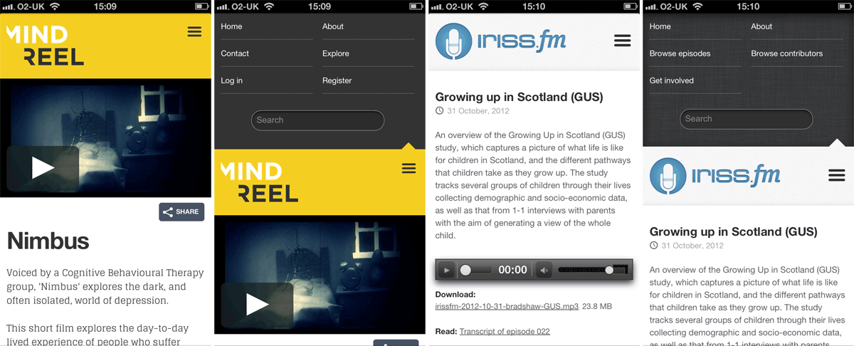
By way of an example, the image below shows the same web page (the homepage of Mindreel) as it would be laid out for a modern smartphone, tablet (in portrait) and desktop computer.

Mindreel screen grabs

So what is this RWD thing exactly?

While it’s beyond the scope of this post to detail the nuts and bolts of how RWD is implemented, it’s important to understand that RWD is a methodology, not a technology. Responsive sites are built using the same core technologies as every other web page (HTML, CSS and JavaScript) – the differences lie primarily in the ways in which these technologies are used and how they interact. It should be noted though that most implementations of responsive designs rely, in part at least, on the users’ web browser being compatible with the latest versions of these technologies. With modern browsers and devices this isn’t an issue, but it does require a little extra consideration to ensure that our responsive designs work in a satisfactory manner with legacy browsers, such as Microsoft’s Internet Explorer versions 8 and older.

And what it isn’t


Responsive design doesn’t involve sniffing out different devices or browsers (that way madness lies), and it certainly doesn’t involve the production of separate ‘mobile’ and ‘desktop’ versions of websites. RWD is very much a ‘publish once, display as appropriate’ solution.

Responsive projects at Iriss

So now that we’ve covered the basics of what RWD is (and isn’t), let’s take a look at how we implemented it across a couple of recent projects at Iriss, and some of the key decisions we had to make.

Adaptive or fluid layouts

The first choice that needs to be made when designing a responsive site is whether to use adaptive or fluid layouts. Adaptive layouts use multiple fixed-width designs (ie mobile/narrow/normal/wide) and switch between them as appropriate. Fluid layouts flow the content out to fill the width of the screen whatever it might be, like the same quantity of water poured into either a tall glass or a wide bowl.

Neither approach is ever entirely right nor entirely wrong, but both bring issues and compromises. Adaptive layouts can result in wasted space where the screen size used falls between the sizes you offer, and you need to make a call on just how many different sizes you’re willing to cater for (which becomes crucial once we get down to the difference in screen width between the millions of smartphones in circulation). Similarly, while fluid designs mean not having to make difficult decisions about where you draw the lines of your supported screen widths (remember, they’ll flow to fill the available space, no matter how narrow or wide it may be), they often do so at the cost of undesirable intermediary stages. For example, if we look at the excellent North Lanarkshire’s Working website, although its fluid design works very well at the extremes (smartphone and PC), it works less well for devices that fall in between (such as some tablets).

North Lanarkshire screen grabs

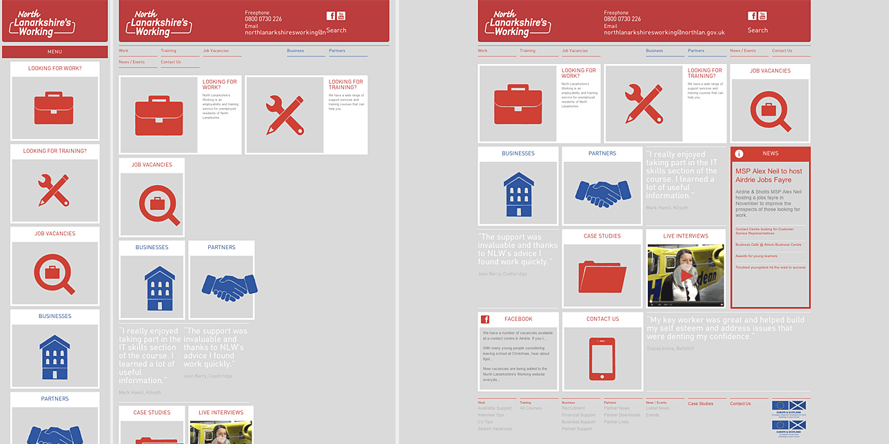
That’s not to suggest that the North Lanarkshire’s Working website is flawed or badly designed in any way – it’s an excellent piece of work – but it does illustrate the compromises that, as designers, we sometimes need to make.

What about a hybrid approach?

At Iriss, we’ve settled on a hybrid, or mixed, approach for screen layouts. For both Iriss.fm and Mindreel, we opted for a system which uses adaptive fixed-width layouts for narrow, normal and wide layouts (covering everything from the most popular brand of tablet to desktop computers) but switches to a fluid layout for anything smaller. This means that all smartphones, most e-book readers and smaller Android-based tablets will get a version of the narrowest layout, but flowed to fill their screens, while larger devices will get a carefully considered fixed-width layout that’s better suited to their larger screen real estate.

Counting columns

For Iriss.fm we arrived early in the development stage at a design which presented content (episodes, contributors, etc) as a number of panels arranged in columns on the page. This meant that we were faced with a decision as to what we prioritise across the different screen sizes – do we keep the same number of columns and make the panels progressively narrower across smaller screens, or do we preserve the width of the panels at the cost of reducing the number of columns? In the end we did a little of both.

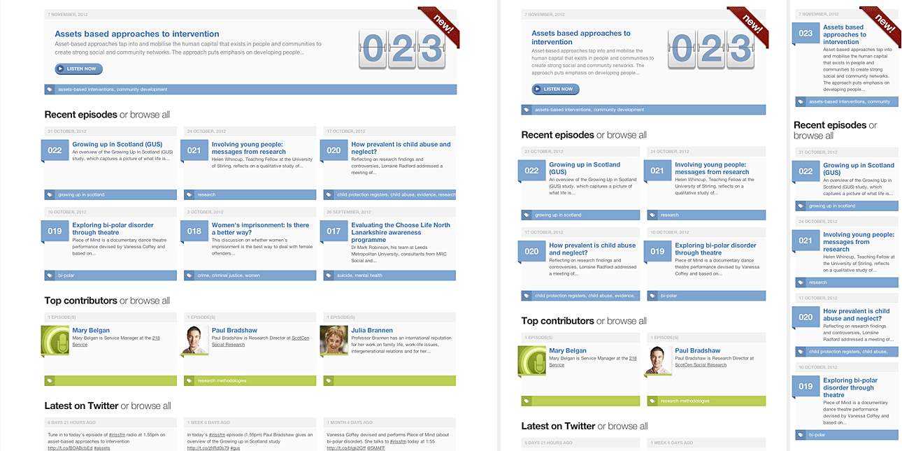
We settled on a solution that uses a three-column grid for both normal and wide layouts (changing the panel width as appropriate), then we drop to a two-column grid for the narrow layout, before finally going down to a single-column layout for the fluid ‘smartphone’ version. The wireframe below shows the difference between the normal, narrow and mobile layouts, as they’d appear on an iPad held in landscape (normal) and portrait (narrow) orientations, and also on an iPhone (mobile).

Planning IRISS.FM column layout

In addition to varying the number of columns across layouts, we also elected to modify the amount of information that we’d show the user in different layouts of the homepage. The graphic below shows wide, narrow and ‘smartphone’ layouts: note that we reduce the number of panels in the ‘episodes’, ‘contributors’ and ‘tweets’ fields as we switch from three-column to two-column configurations (from six/three/three to four/two/two). We chose to do this partly to present a more appropriate amount of content given the screen area available, but also to ensure there was no excess white-space resulting from having an odd number of panels appearing across an even number of columns.

IRISS FM screen grabs

Prioritising content

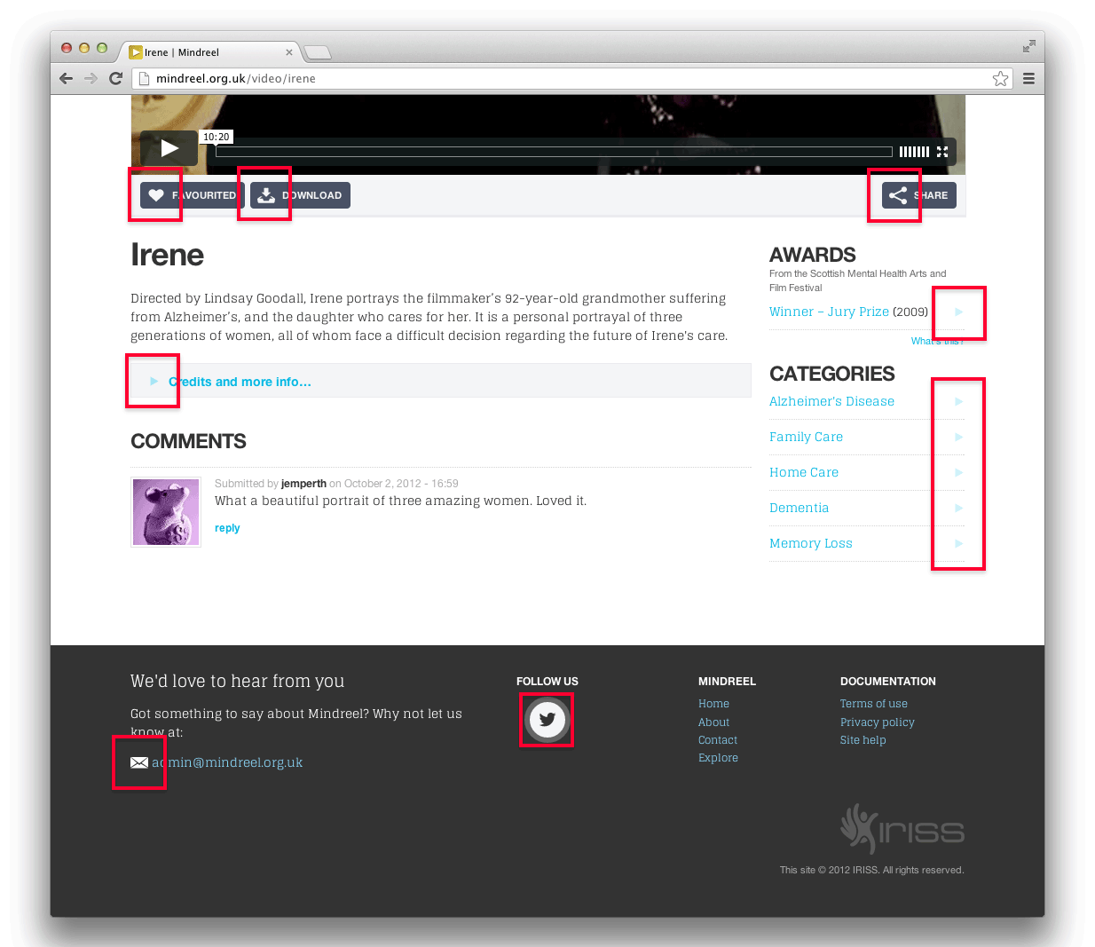
As the above illustrates, designing for smaller screens isn’t just a matter of adjusting layout. Sometimes you need to adjust the amount of content too. With both Iriss.fm and Mindreel we spent some times prioritising the content and, where appropriate, took the decision to hide some tertiary content from very small screens. The image below shows the contrast between the footers of the normal and mobile layouts of a page on Mindreel.

Mindreel footer design screen grabs

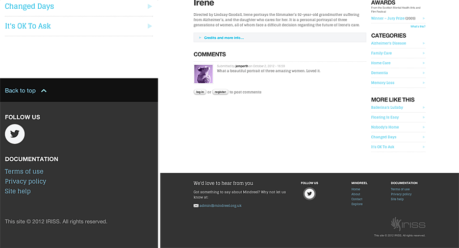
In this case we chose to hide the footer navigation (which is merely a repeat of the primary navigation for convenience), the email link and also to simplify the Twitter link and IRISS credit. Note, however, that we added a ‘back to top’ link, as some of the pages on Mindreel can get quite long when rendered in a single column format.

Getting around

One of the greatest challenges faced when implementing a responsive design is deciding what to do about navigation. In the past, navigation on web sites has generally tended to be either horizontal along the top of the page, or listed down the left-hand side.

For both IRISS.FM and Mindreel, we settled on the traditional horizontally arranged list as the best solution for wider screens, but quickly realised that wasn’t going to work for smaller mobile devices. After looking at several possible ideas, we eventually settled on an off-canvas solution. In both cases we chose to move both the primary navigation and site search field off the top of the screen. We then introduced a three-bar icon (the new de-facto standard for fly-in menus) which toggles the navigation area at the top of the screen.

Mobile navigation designs

Making it all work in legacy browsers

Unfortunately, as mentioned above, none of this responsive design work will be available for people stuck using legacy systems. RWD, at least as we implement it at IRISS, relies on something called media queries to determine the width of the screen that the site is being rendered on. Media queries are part of the CSS3 specification and, as such, aren’t supported by older browsers such as Internet Explorer 7 & 8.

Our fall-back solution for people forced to persevere with these older browsers is to ensure that they receive the ‘normal’ fixed-width layout, which is based around the familiar 960 grid. As, by definition, these users aren’t on modern mobile devices, we can safely assume that their screens will mostly be able to display that width of content without too much difficulty.

Without wanting to get too much into implementation details, we serve up this layout, not by trying to sniff for old versions of Internet Explorer (which would be a REALLY unreliable way to do things), but by testing for support of modern CSS. In simple terms, our sites ask:

“Do you understand what media queries are? If so: great! do this; if not, that’s ok, just do this instead.”

Conclusion: The only constant on the internet is change

These are just a few examples of the ways that we’re using responsive design at IRISS. It’s our hope that working this way helps us create the best custom solutions for the widest range of users on an ever-expanding range of devices. We use RWD to improve the products we make and, to some extent at least, to future-proof them too. It’s not an absolute final answer and, as a recent development, best practices are still being established. However, we believe that working this way allows us to tailor our content to best suit all of our users, irrespective of the technology or device they’ve chosen to access our content from. And that was kind of the point of the web all along.