Hi, I’m Ian and I’m an Interactive Designer here at Iriss. Today I’m going to take a look at Responsive Web Design (RWD), and how we’ve implemented it in a couple of recent IRISS projects.
Background
The last few years have seen a fundamental shift in the way people access and use the web. In 2012 the Internet is no longer limited to your computer screen. It’s just as likely that you’re reading this article on your phone, your tablet, your laptop/netbook/ultrabook (and if you’re reading this a few years down the line, I can only imagine what you’re reading it on!) As a web designer, this new multi-platform, post-PC world presents some interesting challenges.
As a community, web designers are well-practised in the art of self-deception. For years we’ve pretended that we knew, or at least had a rough idea of, the dimensions of the screen that the people who use the things we build will view them on. We embraced something called the 960 grid in the belief that a one-size-fits-all system would streamline our design process while providing a layout that would work for (nearly) all of our end users. We fooled ourselves into believing that something we couldn’t possibly know (the size of our end users’ screens) could be standardised as something we did know. In short, and to channel Donald Rumsfeld for a moment, we had chosen to treat a known-unknown as if it where a known-known. With the rise of the mobile web, however, we’ve been forced into recognising the unsustainability of that delusion: the simple truth is that we have no way of knowing the size, ratio and resolution of the screens on which our designs will ultimately appear. The solution…?
Responsive Web Design (RWD)
RWD can most simply be defined as a method that allows web pages to respond to fit their environment. So when you visit a responsive web page, its design should take our multi-platform world into account, and morph to ideally match the size and shape of the screen you’re viewing it on.
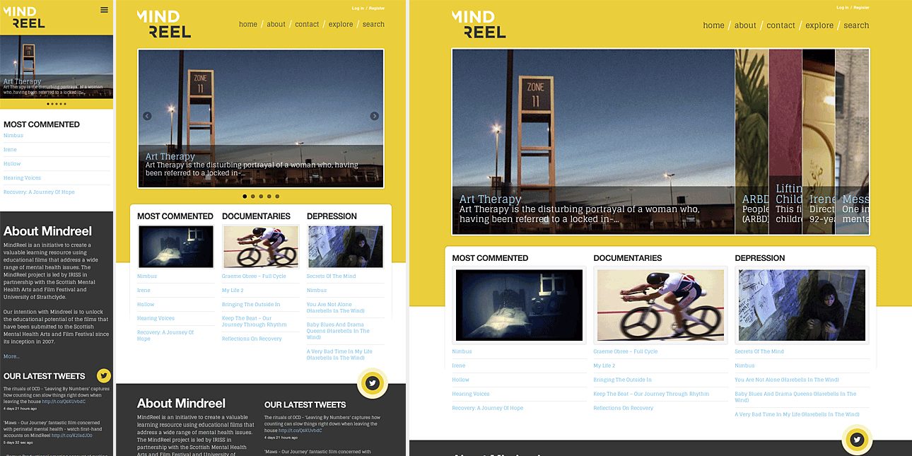
By way of an example, the image below shows the same web page (the homepage of Mindreel) as it would be laid out for a modern smartphone, tablet (in portrait) and desktop computer.
So what is this RWD thing exactly?
While it’s beyond the scope of this post to detail the nuts and bolts of how RWD is implemented, it’s important to understand that RWD is a methodology, not a technology. Responsive sites are built using the same core technologies as every other web page (HTML, CSS and JavaScript) – the differences lie primarily in the ways in which these technologies are used and how they interact. It should be noted though that most implementations of responsive designs rely, in part at least, on the users’ web browser being compatible with the latest versions of these technologies. With modern browsers and devices this isn’t an issue, but it does require a little extra consideration to ensure that our responsive designs work in a satisfactory manner with legacy browsers, such as Microsoft’s Internet Explorer versions 8 and older.
And what it isn’t…
Responsive design doesn’t involve sniffing out different devices or browsers (that way madness lies), and it certainly doesn’t involve the production of separate ‘mobile’ and ‘desktop’ versions of websites. RWD is very much a ‘publish once, display as appropriate’ solution.
Responsive projects at Iriss
So now that we’ve covered the basics of what RWD is (and isn’t), let’s take a look at how we implemented it across a couple of recent projects at Iriss, and some of the key decisions we had to make.
Adaptive or fluid layouts
The first choice that needs to be made when designing a responsive site is whether to use adaptive or fluid layouts. Adaptive layouts use multiple fixed-width designs (ie mobile/narrow/normal/wide) and switch between them as appropriate. Fluid layouts flow the content out to fill the width of the screen whatever it might be, like the same quantity of water poured into either a tall glass or a wide bowl.
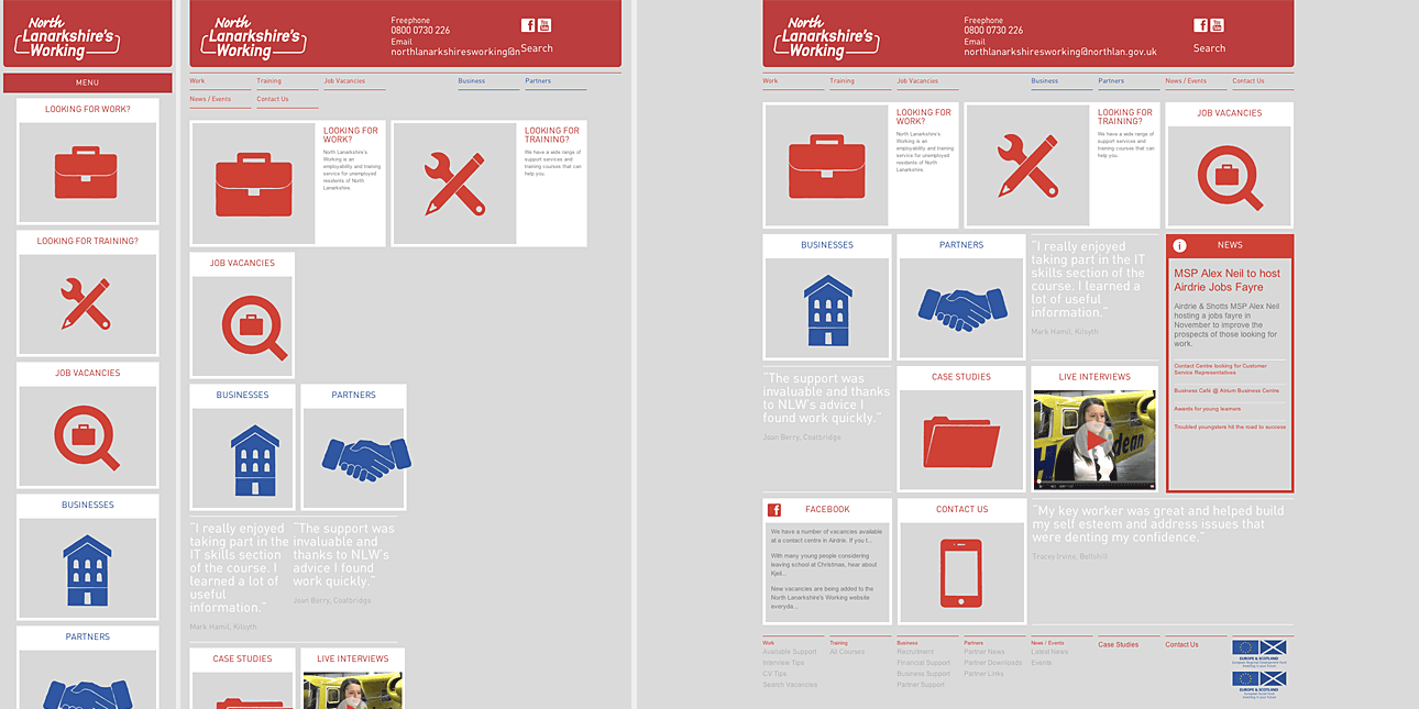
Neither approach is ever entirely right nor entirely wrong, but both bring issues and compromises. Adaptive layouts can result in wasted space where the screen size used falls between the sizes you offer, and you need to make a call on just how many different sizes you’re willing to cater for (which becomes crucial once we get down to the difference in screen width between the millions of smartphones in circulation). Similarly, while fluid designs mean not having to make difficult decisions about where you draw the lines of your supported screen widths (remember, they’ll flow to fill the available space, no matter how narrow or wide it may be), they often do so at the cost of undesirable intermediary stages. For example, if we look at the excellent North Lanarkshire’s Working website, although its fluid design works very well at the extremes (smartphone and PC), it works less well for devices that fall in between (such as some tablets).
That’s not to suggest that the North Lanarkshire’s Working website is flawed or badly designed in any way – it’s an excellent piece of work – but it does illustrate the compromises that, as designers, we sometimes need to make.
What about a hybrid approach?
At Iriss, we’ve settled on a hybrid, or mixed, approach for screen layouts. For both Iriss.fm and Mindreel, we opted for a system which uses adaptive fixed-width layouts for narrow, normal and wide layouts (covering everything from the most popular brand of tablet to desktop computers) but switches to a fluid layout for anything smaller. This means that all smartphones, most e-book readers and smaller Android-based tablets will get a version of the narrowest layout, but flowed to fill their screens, while larger devices will get a carefully considered fixed-width layout that’s better suited to their larger screen real estate.
Counting columns
For Iriss.fm we arrived early in the development stage at a design which presented content (episodes, contributors, etc) as a number of panels arranged in columns on the page. This meant that we were faced with a decision as to what we prioritise across the different screen sizes – do we keep the same number of columns and make the panels progressively narrower across smaller screens, or do we preserve the width of the panels at the cost of reducing the number of columns? In the end we did a little of both.
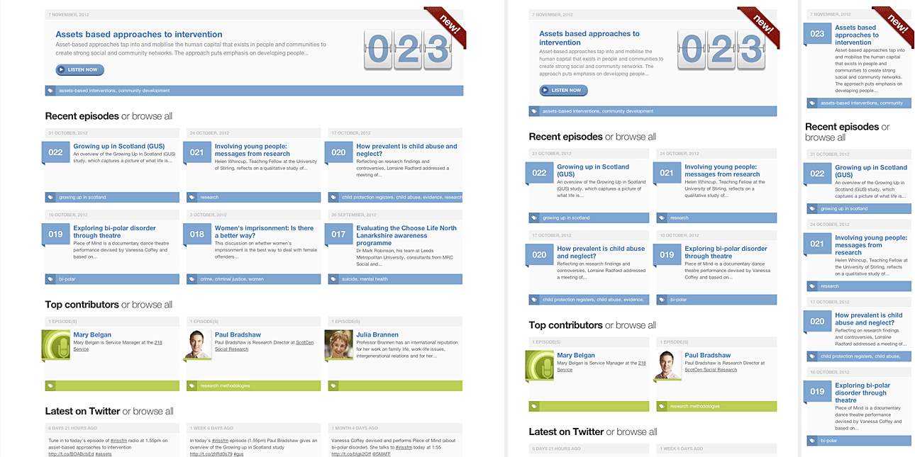
We settled on a solution that uses a three-column grid for both normal and wide layouts (changing the panel width as appropriate), then we drop to a two-column grid for the narrow layout, before finally going down to a single-column layout for the fluid ‘smartphone’ version. The wireframe below shows the difference between the normal, narrow and mobile layouts, as they’d appear on an iPad held in landscape (normal) and portrait (narrow) orientations, and also on an iPhone (mobile).
In addition to varying the number of columns across layouts, we also elected to modify the amount of information that we’d show the user in different layouts of the homepage. The graphic below shows wide, narrow and ‘smartphone’ layouts: note that we reduce the number of panels in the ‘episodes’, ‘contributors’ and ‘tweets’ fields as we switch from three-column to two-column configurations (from six/three/three to four/two/two). We chose to do this partly to present a more appropriate amount of content given the screen area available, but also to ensure there was no excess white-space resulting from having an odd number of panels appearing across an even number of columns.
Prioritising content
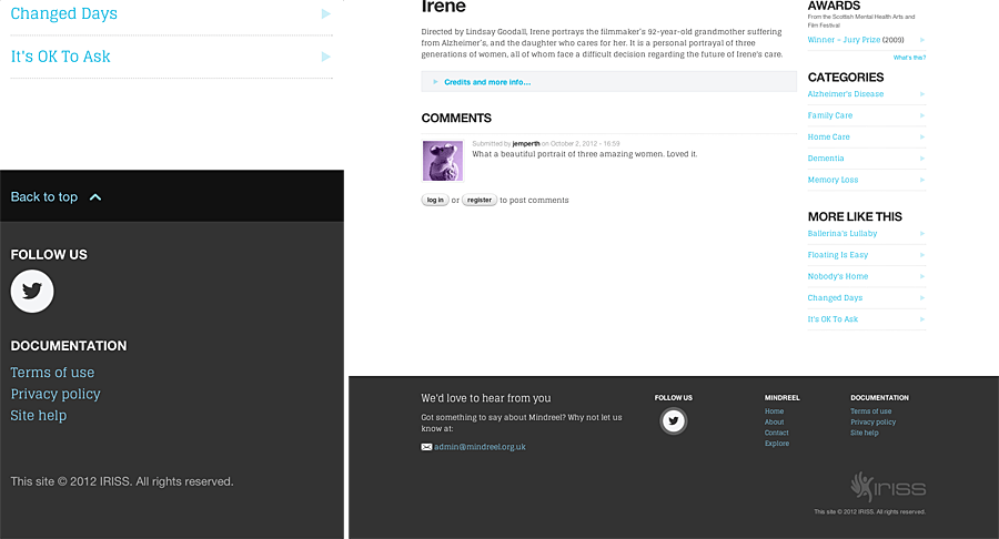
As the above illustrates, designing for smaller screens isn’t just a matter of adjusting layout. Sometimes you need to adjust the amount of content too. With both Iriss.fm and Mindreel we spent some times prioritising the content and, where appropriate, took the decision to hide some tertiary content from very small screens. The image below shows the contrast between the footers of the normal and mobile layouts of a page on Mindreel.
In this case we chose to hide the footer navigation (which is merely a repeat of the primary navigation for convenience), the email link and also to simplify the Twitter link and IRISS credit. Note, however, that we added a ‘back to top’ link, as some of the pages on Mindreel can get quite long when rendered in a single column format.
Getting around
One of the greatest challenges faced when implementing a responsive design is deciding what to do about navigation. In the past, navigation on web sites has generally tended to be either horizontal along the top of the page, or listed down the left-hand side.
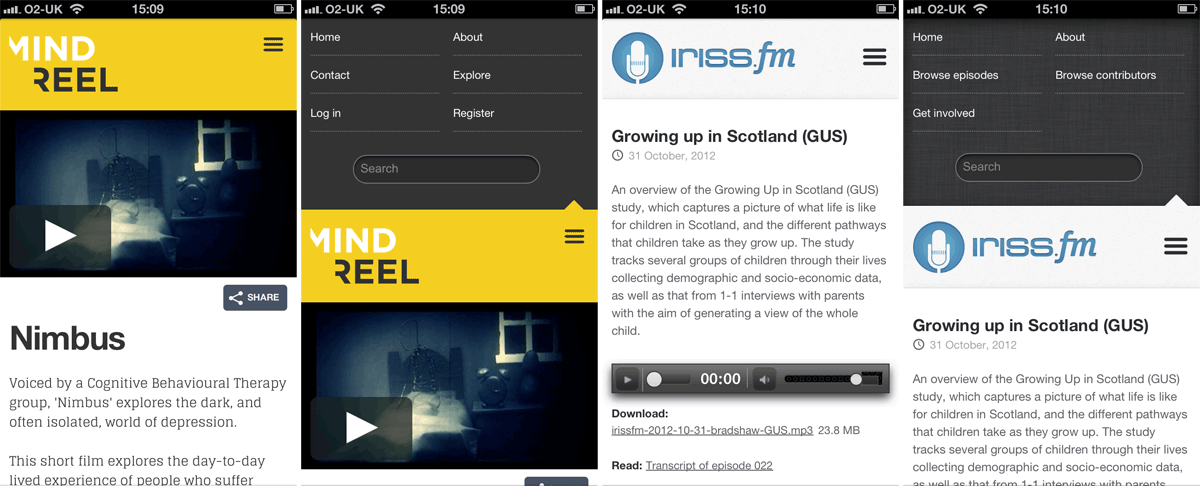
For both IRISS.FM and Mindreel, we settled on the traditional horizontally arranged list as the best solution for wider screens, but quickly realised that wasn’t going to work for smaller mobile devices. After looking at several possible ideas, we eventually settled on an off-canvas solution. In both cases we chose to move both the primary navigation and site search field off the top of the screen. We then introduced a three-bar icon (the new de-facto standard for fly-in menus) which toggles the navigation area at the top of the screen.
Making it all work in legacy browsers
Unfortunately, as mentioned above, none of this responsive design work will be available for people stuck using legacy systems. RWD, at least as we implement it at IRISS, relies on something called media queries to determine the width of the screen that the site is being rendered on. Media queries are part of the CSS3 specification and, as such, aren’t supported by older browsers such as Internet Explorer 7 & 8.
Our fall-back solution for people forced to persevere with these older browsers is to ensure that they receive the ‘normal’ fixed-width layout, which is based around the familiar 960 grid. As, by definition, these users aren’t on modern mobile devices, we can safely assume that their screens will mostly be able to display that width of content without too much difficulty.
Without wanting to get too much into implementation details, we serve up this layout, not by trying to sniff for old versions of Internet Explorer (which would be a REALLY unreliable way to do things), but by testing for support of modern CSS. In simple terms, our sites ask:
“Do you understand what media queries are? If so: great! do this; if not, that’s ok, just do this instead.”
Conclusion: The only constant on the internet is change
These are just a few examples of the ways that we’re using responsive design at IRISS. It’s our hope that working this way helps us create the best custom solutions for the widest range of users on an ever-expanding range of devices. We use RWD to improve the products we make and, to some extent at least, to future-proof them too. It’s not an absolute final answer and, as a recent development, best practices are still being established. However, we believe that working this way allows us to tailor our content to best suit all of our users, irrespective of the technology or device they’ve chosen to access our content from. And that was kind of the point of the web all along.

